Join us as we discover, learn, and create! This Art Education blog is intended as a resource for educators and a showcase of student learning in Manitowoc, WI.
Tuesday, October 30, 2012
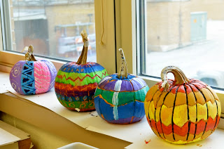
Painted Pumpkins
Our pumpkins at the Junior High were painted, then carved with linoleum cutters... and finished just in time for Halloween! And not a moment too soon; they were just beginning to feel a little squishy!
Sunday, October 28, 2012
Will this fit in a Corolla?
Time once again to play one of my favorite traveling-teacher games! Perhaps other multi-school Art teachers out there can relate. Over the years I have found myself carrying a wide variety of cargo to, from, and between schools that must raise the eyebrows of surrounding motorists.
Q: How many wooden chairs will fit in the back seat and trunk of a Corolla?
A: If you really mean business, the answer is five.
Q: How many wooden chairs will fit in the back seat and trunk of a Corolla?
A: If you really mean business, the answer is five.
Monday, October 22, 2012
Warm/Cold Self Portraits
While reviewing color theory and discussing the use of CONTRAST in artwork, 7th and 8th grade students created these fantastic self-portraits. I found a similar lesson on another teacher's classroom blog, but sadly neglected to bookmark the link and never could find it again!
Materials we used:
18"x24" watercolor paper
Watercolor paint
colored pencils
Preliminary work:
1. Our class spent several periods sketching our faces from the reflection in a mirror. We warmed up with blind contour drawings, and progressed to gesture drawings, learning to position facial features. When drawing the final self-portraits, students were encouraged to draw their figures slightly off-center, including the table in front of them for depth, and objects from the room in the background.
2. The initial drawing was traced in Sharpie (we used both fine and ultra-fine tip). Before painting, students made swoopy pencil lines over the top of the work to fracture the space into smaller sections.
Watercolor layer:
1. Looking at sample artworks from history on the projector, we discussed the use of color temperature to bring objects forward (warm colors) or make them recede (cool colors).
2. Students practiced the wet-on-wet watercolor painting technique on scratch paper (first paint with pure water, then add pigment; let the water spread the pigment).
3. Using primarily warm colors in the focal point and cool colors in the background, students were able to demonstrate use of contrast and emphasis. They were shown how to paint one fractured section at a time (sections could be determined by pencil lines, Sharpie lines, or both).
Texture layer:
When the paint was finished and dry, students used colored pencils to add different line and shape patterns to each fractured space in their artwork. They could use warm or cool colors to do this as long as their choices unified and balanced the work. The colored pencil should be noticeable but not overpowering.
Overall, students found positive individual success with this lesson. It was excellent for review of art vocabulary, making good use of so many elements of art and principles of design. The use of color and texture to create contrast and emphasis was so key to the outcome of this project that students with less advanced drawing skills were still able to achieve a high amount of success.
Wednesday, October 17, 2012
Contour Drawing: Expressive Hands
This just finished: Expressive Hand drawings by the 7th and 8th grade art students!
The original lesson was found here on the Incredible Art Department site.
Drawing hands is fantastic, challenging practice for building observational skills to recognize angles and proportions. Students made numerous hand studies, drawing from life and utilizing a printed American Sign Language alphabet.
After the practice studies were complete, students chose three hands to draw on construction paper and arrange on an abstract background to create BALANCE and MOVEMENT. Students reflected on the finished product to identify the messages expressed by the hands in their classmates' work.
Tuesday, October 16, 2012
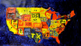
Collaborative Jasper Johns: Map
Each year, my 5th grade students create a large-scale collaborative Pop Art work; last year, we were inspired by Jasper Johns to recreate Flag using soda can boxes (lesson here).
An alternate Jasper Johns image that also makes a delightful lesson is Map (1961). Using a discarded classroom map of the United States, we first cut out each State like a puzzle piece (although the smaller states in New England were cut out in "clumps" so they wouldn't get lost).
The potential directions that can be taken with lesson objectives are quite extensive; there is great potential for students to research and share information and aspects of assigned states. We chose a focus on Jasper John's use of symbols in his art--how he borrowed common images such as maps and flags and portrayed them in a new way.
States were distributed evenly between students amongst excited chatter centered mostly around travel and NFL teams from respective states. States were textured with newspaper. Each student painted his/her state with primary colors of acrylic mixed with gloss medium to increase translucency. Finally, students located states on a list I provided to find and label each piece with proper abbreviations.
I think we did a pretty good job puzzling everything back together... our apologies for accidentally gluing South Dakota upside-down.
Monday, October 8, 2012
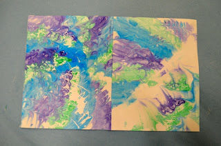
Shaving Cream Marbling
So, I've heard a couple times that you can marble paper using shaving cream, but until today had never tried it. I was looking for an interesting one-day activity as we approach a busy time of year with several half days and alternate schedules for special events. In a short summary of today's lunch hour adventure: it works.
Materials:
Tray for shaving cream (I used 8"x10" foam trays)
Several bottles of shaving cream per class
Small pieces of mat board or cardboard (roughly 3x3")
Pigment (I used Prang watercolors, which I find preferable to Crayola for student-grade WC)
Soft brushes
Combing devices: forks, hair picks, wide-tooth combs, toothpicks, etc.
Cardstock for printing
Step One and Two: spray shaving cream on tray, then smooth it like frosting on a cake with a piece of cardboard to 1" thick.
Brush watercolor lightly to the surface of the shaving cream without pressing the brush into the material. Using lines or smaller/thinner areas of color will help the marbling texture to show up in later steps.
Step Three: use a comb to lightly pull lines through the pigment. Just scratch the surface, do not drag the comb too deeply through the shaving cream. My most successful tool for this step was a DIY comb made from taping toothpicks between two pieces of mat board. The thinner tines did not "goop up" as easily as did the fork and hair comb.
Step Four: press cardstock lightly into pigment. I used white cardstock cut to 6"x9" and folded in half to make a good greeting card size.
This is normal:
Step Five: Use mat board scraps to scrape off the shaving cream from your print. I did this immediately and it did not smear the design. If your paint was especially thick or runny (as in watered-down tempera), I read other sources that recommended leaving the card to dry overnight before scraping.
Side one: done.
Out of curiousity, I pulled a "ghost print" from the remaining pigment on the shaving cream for the back of my greeting card. I liked the results!
Materials:
Tray for shaving cream (I used 8"x10" foam trays)
Several bottles of shaving cream per class
Small pieces of mat board or cardboard (roughly 3x3")
Pigment (I used Prang watercolors, which I find preferable to Crayola for student-grade WC)
Soft brushes
Combing devices: forks, hair picks, wide-tooth combs, toothpicks, etc.
Cardstock for printing
 |
| Materials |
Step One and Two: spray shaving cream on tray, then smooth it like frosting on a cake with a piece of cardboard to 1" thick.
Brush watercolor lightly to the surface of the shaving cream without pressing the brush into the material. Using lines or smaller/thinner areas of color will help the marbling texture to show up in later steps.
Step Three: use a comb to lightly pull lines through the pigment. Just scratch the surface, do not drag the comb too deeply through the shaving cream. My most successful tool for this step was a DIY comb made from taping toothpicks between two pieces of mat board. The thinner tines did not "goop up" as easily as did the fork and hair comb.
Step Four: press cardstock lightly into pigment. I used white cardstock cut to 6"x9" and folded in half to make a good greeting card size.
This is normal:
Step Five: Use mat board scraps to scrape off the shaving cream from your print. I did this immediately and it did not smear the design. If your paint was especially thick or runny (as in watered-down tempera), I read other sources that recommended leaving the card to dry overnight before scraping.
Side one: done.
Out of curiousity, I pulled a "ghost print" from the remaining pigment on the shaving cream for the back of my greeting card. I liked the results!
Subscribe to:
Posts (Atom)


