
Wednesday, February 29, 2012
Tuesday, February 28, 2012
Youth Art Month: The Adventure Begins
Thus begins the setup for our annual student art exhibit at the Rahr-West Art Museum!


Monday, February 27, 2012
Jasper Johns-Inspired American Flag
Presidents' Day.... was last Monday.
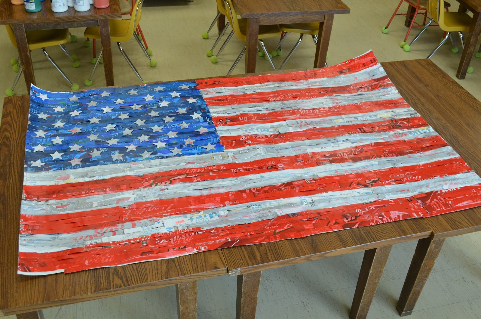
Despite the belated nature of this post, 5th grade students did spend their class time piecing together this symbol of the USA, in the style of American Pop artist Jasper Johns!
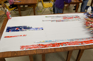
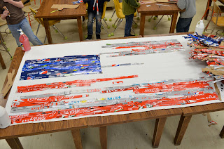
Back in January, I put out the all-call for soda boxes of red, blue, and silver. Pop Art, such as Jasper Johns' flag paintings, uses everyday objects and consumer culture as subject matter... so these Coke & Pepsi boxes worked on a level beyond mere color!
In one month's time, our pile of soda boxes had finally grown to the point where we could begin. I estimated that we would need about 10 boxes of each color to safely cover the flag, but we might have gotten by on a few less. For the template, I projected and traced the image on a large roll of card stock (4 feet high) that someone had donated several years ago (I wish I knew where I could get more!!!).
When the 5th graders came into class, we spent the beginning of class reading an article in Scholastic Art about how Johns created his flag. Students cut apart the boxes into 1-inch strips, then took turns up at the flag gluing them down with Tacky Glue. After this was complete, we painted a sheer layer of acrylic red, white, and blue to seal the strips down. To make the paint translucent, we mixed it with acrylic gel medium (using glossy gel gives it a nice sheen). Finally: we traced and glued the stars down!
The blog will be updated with photos as the flag makes its tour... first, parent-teacher conferences; next at Youth Art Month; and finally at its new permanent home in the school library.


Despite the belated nature of this post, 5th grade students did spend their class time piecing together this symbol of the USA, in the style of American Pop artist Jasper Johns!
Back in January, I put out the all-call for soda boxes of red, blue, and silver. Pop Art, such as Jasper Johns' flag paintings, uses everyday objects and consumer culture as subject matter... so these Coke & Pepsi boxes worked on a level beyond mere color!
In one month's time, our pile of soda boxes had finally grown to the point where we could begin. I estimated that we would need about 10 boxes of each color to safely cover the flag, but we might have gotten by on a few less. For the template, I projected and traced the image on a large roll of card stock (4 feet high) that someone had donated several years ago (I wish I knew where I could get more!!!).
When the 5th graders came into class, we spent the beginning of class reading an article in Scholastic Art about how Johns created his flag. Students cut apart the boxes into 1-inch strips, then took turns up at the flag gluing them down with Tacky Glue. After this was complete, we painted a sheer layer of acrylic red, white, and blue to seal the strips down. To make the paint translucent, we mixed it with acrylic gel medium (using glossy gel gives it a nice sheen). Finally: we traced and glued the stars down!
The blog will be updated with photos as the flag makes its tour... first, parent-teacher conferences; next at Youth Art Month; and finally at its new permanent home in the school library.
The Process:


Tuesday, February 21, 2012
The Memory House
Youth Art Month is coming soon!
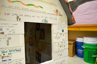
One of the projects my students and I are very excited to share in this year's show at the Rahr-West Art Museum this March: The 6th Grade Memory House.
In the past, we have made Joseph Cornell-inspired memory boxes in the 6th grade. I suppose a memory house is the logical progression from shoeboxes? Actually, the idea was planted when I visited the Madison Museum of Contemporary Art (Madison, WI) a little over a year ago and viewed the work of the Clayton Brothers; notably, the Tim House. The concept was similar to Cornell's: an enclosed space, an assemblage of symbolic objects that play upon memories. What excited me about the possibility of a memory house was the potential for collaboration between students.
After an adventurous visit to a home improvement store to pick up four 4'x8' styrofoam sheets (Special thank you to a colleague with a Jeep who helped me out!), I measured and constructed the basic shell of the house in the Art Room. The three 6th grade classrooms began work by sharing and writing a list of specific memories from their time in elementary school. Each student made a repousse shingle and several pieces of siding using these memories accompanied by illustrations. Students also volunteered in turns to paint the inside walls, cover the chimney in tin foil, and man the hot glue guns to assemble pieces as they were completed. Finally, each student created a self portrait to hang on the wall inside the house.


Wednesday, February 8, 2012
Mythical Menagerie
Levi Fisher Ames was an American Civil War veteran from Wisconsin who carved an impressive collection of real and imaginary animal species out of wood. To the artist, sharing the stories of the animals (such as the mythical "Hodag" of the North Woods) was an essential component of experiencing his work. Presently, the collection is housed near our community at the wonderful John Michael Kohler Arts Center in Sheboygan, WI.
Students spent time brainstorming different mixtures of animals, utilizing the wonder that is the Switcheroo Zoo (seriously, try it! Such fun!). After sketching their new mythical creature, naming it, and writing its story, we got out the clay.
Instead of glazing our sculptures, we painted a black acrylic base on the bisque-fired projects. When this dried, we designed the surface with metallic acrylics.


Tuesday, February 7, 2012
Contour Line Drawing
We are in our second week of the new semester! The syllabus has been read; the shelves have been labeled. 1st hour Drawing & Printmaking is up and running!
Our skill practice the first week consisted of various contour line drawing exercises. We viewed contour drawings by master artist Pablo Picasso (have you heard of him? He's pretty good), to identify and discuss line styles.
Key points:
Students worked on white paper from the roll usually kept for protecting tables during messy projects. Each sheet was roughly 40x40" to begin with. I chose to have students draw using acrylic paint watered down to a liquid consistency; we each began with a 1/2" flat brush and black paint. When the main plant body had been rendered, students used larger 1" brushes to add weight to selected contours. They were given the freedom to add green accents at their discretion, and choose what contours would best serve the composition in the background. When all the brushwork was complete, students went into the work with black permanent marker to add the finest lines. We are actually still working on this final step, but I had a camera and a few extra minutes... so here are some samples!


Our skill practice the first week consisted of various contour line drawing exercises. We viewed contour drawings by master artist Pablo Picasso (have you heard of him? He's pretty good), to identify and discuss line styles.
Key points:
- Contour line drawing forces us to recognize lines, shapes, angles, and proportion-- and translate them into two-dimensional form
- lines must be thoughtfully chosen and applied in order to communicate the form in the simplest, most clarifying manner
- Different weights can be placed upon lines to add or detract visual emphasis
- Repeating a line style adds BALANCE and UNITY to an artwork
Students worked on white paper from the roll usually kept for protecting tables during messy projects. Each sheet was roughly 40x40" to begin with. I chose to have students draw using acrylic paint watered down to a liquid consistency; we each began with a 1/2" flat brush and black paint. When the main plant body had been rendered, students used larger 1" brushes to add weight to selected contours. They were given the freedom to add green accents at their discretion, and choose what contours would best serve the composition in the background. When all the brushwork was complete, students went into the work with black permanent marker to add the finest lines. We are actually still working on this final step, but I had a camera and a few extra minutes... so here are some samples!


Wednesday, February 1, 2012
Joan Miro Constellation Drawings
I try to apply colors like words that shape poems, like notes that shape music. -Joan Miro
Spanish artist Joan Miro painted his Constellation series between 1939-1941 after escaping from France upon the outbreak of WWII. The series of 23 works (including The Morning Star) consists of brightly colored shapes, outlined in black, floating over a softly colored background. Black lines twine through the space, connecting and dissecting shapes as they intersect. As you continue to view the work, hidden images (such as birds or human figures) emerge within the negative spaces.
On Joan Miro day in Art class, excitement runs high as students realize that images are hidden within the constellations. We create a master list of words accompanied by drawings:
The final step is to create a soft background texture using chalk pastels. Every student uses a brown pastel first, holding it on its side and dragging it very softly in long rows across the drawing (don't push down on the pastel! Too much pressure makes it color too darkly!). Two more colors of students' choice are added above the brown layer.


Spanish artist Joan Miro painted his Constellation series between 1939-1941 after escaping from France upon the outbreak of WWII. The series of 23 works (including The Morning Star) consists of brightly colored shapes, outlined in black, floating over a softly colored background. Black lines twine through the space, connecting and dissecting shapes as they intersect. As you continue to view the work, hidden images (such as birds or human figures) emerge within the negative spaces.
On Joan Miro day in Art class, excitement runs high as students realize that images are hidden within the constellations. We create a master list of words accompanied by drawings:
- SHAPES Joan Miro uses (ex. circle, star, triangle, lima bean, and everybody's favorite... floating eyeballs)
- LINES Joan Miro draws (spiral, spiky, curvy, short, long, crisscross, etc.)
The final step is to create a soft background texture using chalk pastels. Every student uses a brown pastel first, holding it on its side and dragging it very softly in long rows across the drawing (don't push down on the pastel! Too much pressure makes it color too darkly!). Two more colors of students' choice are added above the brown layer.


Subscribe to:
Posts (Atom)